Visual Highlights
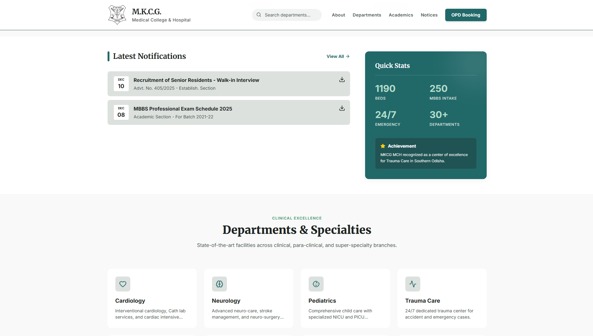
Clean Hero Section
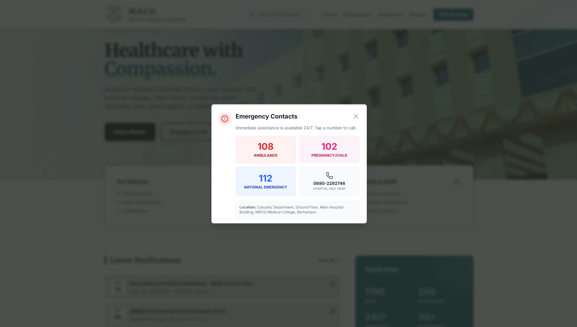
Emergency Quick Access
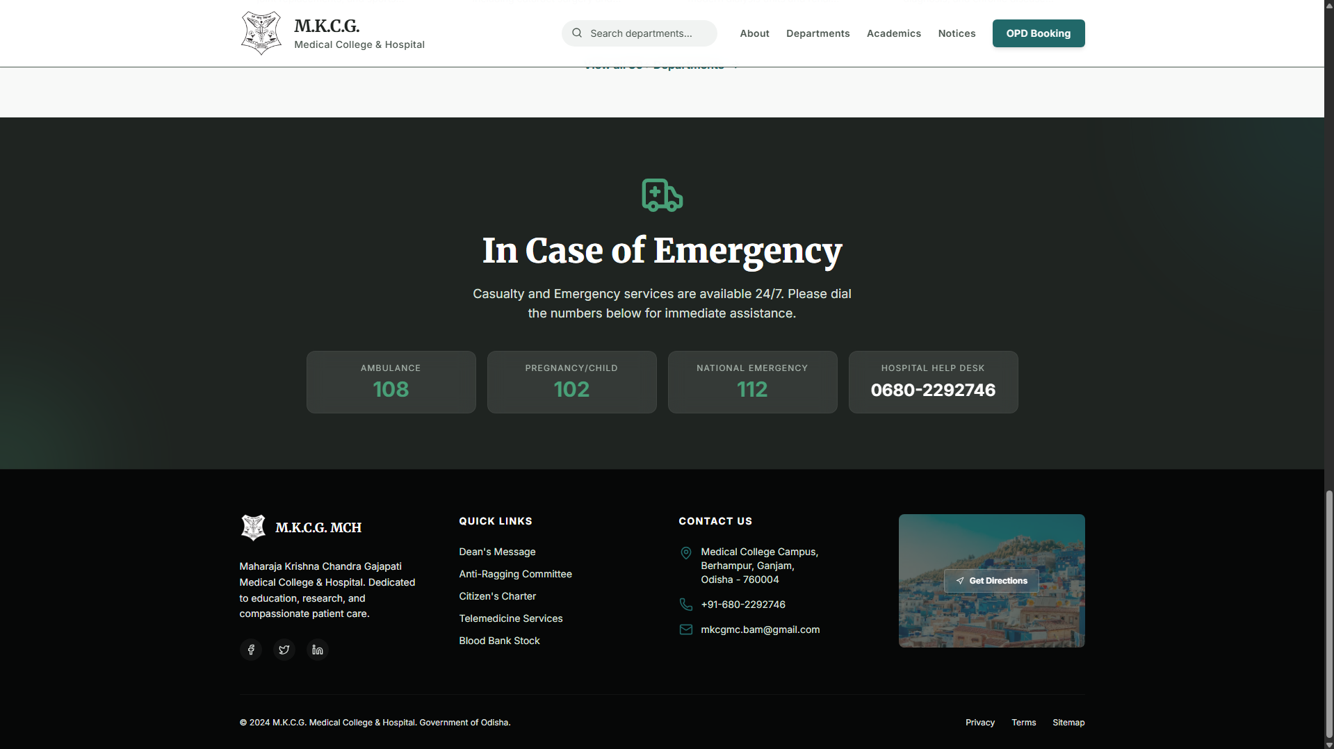
Organized Footer